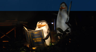
Animatronic & Attraction
Design Services

Professional, experienced, world-class leadership for theme park attractions and other forms of character driven dimensional animation and interactive venues.

I've provided creative guidance and/or animation on more animatronic figures than anyone else on the planet. If it moves and needs personality, I can help make it real.

Animatronic Program Leadership

High-end Development Leadership

Value-Managed Figure Development

Animation Team Director/Program Mgt

Vendor & Field Support Leadership

R&D Creative Leadership

Pipeline Development Leadership

Program Strategy & Planning

Interactive Development Leadership
Figure Development & Production

Blue-Sky & Concept Development

Figure Specification

Production Direction

Figure Setup & Animation

Installation & Show Programming

Documentation & Training Support

R&D Creative Leadership

Interactive Performance Design

Additional Specialties

Interactive System Development

Real-time Editing System Design

CG Live Character UI Design

Character-Robotic Integration

Concept Sketching & Storyboarding

Animatronic Training & Education

Show Quality - Maintenance Support

Mockup & PoC Fabrication

Design Principles

The core tenets that are central to other forms of character animation are equally vital to this medium. This section touches on how a few of those axioms can be applied to theme park performance design with some notes on challenges and opportunities unique to animatronics.

Design Guide #1:
The Eyes Have It


Mr. Potatohead (2008) - Video Eyes

For Mr. Potatohead, the team used a variant of the system I'd developed in the late 90's to create a hybrid CG and practical figure. The original development included custom pieces of software to link off-the-shelf and proprietary system elements together per my specifications. This allowed animators to work in a fully pre-vis environment prior to production rollout and in addition be able animate the eyes and the body simultaneously on the finished figure while using WDI's proprietary show programming tools throughout (which I was also instrumental in developing, providing feature/workflow specs and UI/UX design to compliment Steve Silverstein's amazing software engineering and embedded system design skills).

This created a consistent, high-efficiency single-point performance development pipeline that also facilitated scaling up animator resources to deliver the large quantity of content required for the interactive show design.


Short Path to the Illusion of Cognition

A pair of pupils with good control on two axes, a decent blink and maybe a brow move or two are, in many situations, the most expedient way of getting a character to appear that it is a thinking, self-aware being. Guests tend to forgive quite a bit when eyes behave the way they are expected to.

It's a bit of a cheap trick, playing on the fact that we focus more of our attention on what the eyes are doing than anything else, but a trick that works is valuable, no matter how cheap.

Catch 20/20

The other side of the coin is that the very areas people look at with the most scrutiny are the ones where the most negative animatronic cues tend to occur. This medium is, generally, best with big broad (but not too fast) movement, and worst at detailed expressiveness in the hands and face, and to be frank, we can really only ever achieve a small percentage of overall human expression - maybe 10% - with existing technology.

This inverse relationship of what we want to show and what we can make look good is an important issue to address early in the design process.


Human/Animal Anatomy

The advantage of naturalistic anatomy is that it, by definition, has to follow physics. Human eye muscles actually don't offer that much variation in shape-change: Lids mostly work without lots of angular stretching; brows can do a few things but they are fairly constrained as well; eyes dart, but only on two axes and are always spherical (well, primarily spherical). However, we put so much time into watching faces and developing sensitivity to very subtle variations and combinations that the moment accuracy isn't spot-on, including minor changes in adjacent muscles and tiny micro-expressions, lots of negative cues get thrown.

Fundamental skin and collision/friction issues that directly impact reliability quickly create disadvantages that feel like they totally outweigh the advantages. That is, until you try and work with cartoon eyes...

Cartoon Anatomy

Abstract character facial rules are more forgiving than naturalistic ones in terms of detailed subtlety, but they more than make up for that by breaking the laws of both physics and human expression. Eyebrow cues get pulled into eyelid shapes and visa versa, all elements can shape-change dramatically when creating expressions, and don't necessarily even land in a physically possible state at rest. Any two characters can require vastly differing design approaches, with totally different sets of opportunities and limitations, which can add up fast when tackling an attraction with a large number of well-known IP characters.

These types of problems are fun and interesting to solve, but definitely are not trivial.


Design Guide #2:
No Chewing of the Scenery!
Redirection & Misdirection


Star Tours (2010) - Queue Cuts

With animatronics, keeping Guests' eyes moving is generally a good thing. Drawing attention to other show elements before a performance gets stale can help a lot. Just having other interesting elements for passive distraction is a good start, but timing active manipulation of Guests' attention with audio, lighting and movement is useful in many cases.


Holding the Stage

It doesn't take much scrutiny for the weaknesses of an animatronic figure to become apparent. C3PO is fortunate to be a character defined by a human pretending to be a stiff robot with limited range-of-motion. Still, his control panel is in full view of Guests and he can't really turn to it or actually touch. The animator is left to just bat C3P0's left hand near it once in a while. By himself, C3P0 can't really stay convincing for very long at all, but fortunately there is a lot going on around him.

He works pretty well in the overall scene, except for the minute or so Guests are right in front of him. If making him a stronger presence was ever needed, his staging and function choices would have to be modified and there are many different ways that could be approached and still stay true to the IP.

This same sort of calculus is done for every figure as its staging and performance are worked through. How long does the character need to stay alive and what are the options for making that happen?

Small - Medium - Large

The concept of mixing up scale applies at multiple levels. The animator uses it to keep Guests' eyes busy throughout a performance, using nuanced head or hand gestures for small, upper-body movement as medium and full-body gestures for large, mixing them up and overlaying similar breakdowns in timing to try and disguise the figure's true gestural limitations (this is an oversimplification but demonstrates the concept).

On the scene level, the same game plays out for each discipline - show set, lighting, audio, FX, AP's and SAE's.

Juxtaposition is our friend.


Passive Redirection & Active Misdirection

The designers who laid out the Star Tours pre-show did a good job of creating a space where there is a lot to look at. Quite a bit of storytelling goes on, timing carefully controlled so that the scene works as a whole. The elements aren't particularly complex, with C3PO as probably the biggest operational and presentational risk. Guests move through the space without thinking about that too much because there is so much eye-candy to keep them engaged.

The choreography of multiple show elements in different areas, well-sourced audio/video, use of different visual planes and strong thematic decisions all combine to give this attraction an amazing feeling of immersion.
[Note: I've animated many of the figures in various versions of Star Tours but played no part in the overall show design.]

Show Only What Has to be Shown

The Calimari are a great example of only using what is needed to sell a performance. These figures can be easily over-animated. They don't need to move much, just a bit here and there and always with very careful timing so what little they do looks deliberate and not 'rampy'.

The reflections from their consoles show on their faces along with reflections in the big glass panels in front of them adds passive natural cues that help sell these characters even when they aren't doing anything at all.

For Guests that choose to stare at them for a while, once in a while one of the Calamari needs to just change their focus - look down for a bit or look up for a bit. Anything more or less and the spell will be broken.


Design Guide #3:
Something Old & Something New


Alien Encounter (1995) - Mixed Bag

Both the pre-show and main show of Alien Encounter mixed ancient stage tricks and new technologies: mirror gags dressed up with a bit of laser flash, aging animatronics updated with newer tech and character design, and a theater designed specifically to showcase binaural sound and impressive quick-changes.

The attraction had difficulty finding an audience at a kid-oriented theme park, but not due to a lack of innovative integration of old and new tricks.


Showcase New Technology

Trying to get a presentation edge - add spark - to a new attraction often means working to implement new tech. In some cases that means tailoring the story to fit the technology. For Alien Encounter, the stiffness and physical constraint of the seats were elements required to make the binaural sound work. Adding in the thematic pastiche of an uncaring galactic corporation helped provide cover for the discomort of Guests of being held firmly in place.

Old Doesn't Mean Bad

Some of the best visual tricks have been around for centuries. Whether it's Pepper's Ghost, reflective symmetry, a quick-change lift or any of a hundred theatrical tricks, they can be very useful - particularly when combined with other elements to aid in concealment and visual impact.


Big Bag of Tricks

There are so many constraints involved with animatronic design that you really want the biggest bag of tricks you can get. For example, I appreciate the value of electric actuation, but when that tech is specified and hydraulics aren't on the table there are fewer design options, often limiting some aspects of performance. When you run out of tricks on the technical side, the only remaining option in most cases is to modify creative intent - change the character design, performance and/or story to find a workable solution.

Some technical advancements can be made during design and production, but there's a natural limit to how many new miracles can be pulled off - it's always good to have a wide variety of proven solutions to pull from.

Mix it Up

The quick-change in the alien tube is a good example of mixing old and new technologies. In the show second it took to make the physical change, we had a combination of lighting, concealment and mechanical elements that gave us visually interesting 'toys' to play with. It took quite a bit of experimentation to come up with right mix to keep the room alive, distract the audience from what was going on and pull off the reveal so it felt magical.

The most immpressive applications of new technology generally employ a healthy sprinkling of existing theatrical tricks to help them shine.


Design Guide #4:
Break Expectations


It's Tough to be a Bug (1998) - CG vs. AA

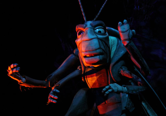
ITTBAB opened before 'A Bugs Life' and the film characters weren't yet designed when we went into production. The character vernacular (with enormous heads and tiny joints among other challenges) was well-suited for computer animation and not-so-much for animatronics . Although the script had Flik walking around on stage throughout the show, Doug Griffith recommended having Flik come in through a hole in the ceiling. This allowed us to show him off dimensionally without exposing paper-thin joints, and also strengthened the theme of being in the bugs' world - and it broke theatrical convention. In addition, having Flik on the ceiling helped get Guests to look up into the 'tree' - the architecture team and Skip Lange deserve kudos because the interior and exterior theater space is really something special in this attraction.

Although there have been quite a few 4D theaters, ITTBAB integrated its show elements better than any I know of (thank you Rick Rothchild). This is also another good example of both misdirection/redirection and technology integration - there were a bunch of innovations and old-school design put into this project (e.g. Amos Avery's Spider mechanism).

We also did some unexpected things. In addition to Flik's staging, Hopper's feet move around, puppeted from below. He literally leaps into the space - at 9' tall that's no small feat given the tiny area he comes out of (hat tip to Larry MacAfee for mechanical design of the lift).


Animatronic Vocabulary

Over the last 50 years, Guests have naturally developed an understanding of what animatronics are and aren't: legs bolted to the ground, stiff lower-bodies, fair medium and large movement but limited in both range and speed, clacking eyes, poor resemblance to the character as portrayed in other media, etc. - often appearing broken. For any animator, it's a difficult list to accept, but it also can't be wished away. Sometimes it's assumed that those of us who have been working with this medium just can't see those things. I can assure you that isn't so. No one is more aware of or wants to break out of the animatronic vocabulary more than an animatronics animator.

The trick is that those elements occur for very real, if unfortunate, reasons. They can be overcome, but only with both an understanding of why they occur and a lot of focused problem-solving. Since we are working with machines that are required to perform dependably and safely for 5000+ hours a year, progress in overcoming these obstacles tends to be painfully slow.

Expanding the Vocabulary

In many cases, the way to approach breaking the norm is to identify very specific things a particular figure performance requires - maybe just a couple of breeches of the standard vocabulary that will set the figure apart - with as much specificity as possible, and then go about negotiating solution options with experienced designers and engineers.

Sometimes the character can be approached from a totally different paradigm. Rules normally associated with a marionette puppet, or utilizing the physics-based approach of a crash dummy or similar deviations. The duty cycle requirement might be circumvented with a strategy of cheap and easy replacement parts, or by reducing the cycles required to a few per day. There are design options, but the underlying requirements are pretty consistent.

Another option is to build a complete animation mechanical, skin and control system from scratch, perhaps with modular subsystems and innovative overall design approaches. Opportunities for this tend to be few and far between, but can theoretically be amortized over multiple projects if the design studio involved has the vision and willingness to plan their project targets to correlate with stepping-stone development of parts of the overall system a few at a time, slowly building a new system over multiple projects.


Mechanical & Fabrication Advancement

In the decades I've been working in this field there have only been a few truly big leaps, and those tend to carry significant caveats and counter-issues:
Electric Actuation: This has cleaned up animatronics by reducing reliance on the messy use of hydraulics and increases potential speed and range-of-motion in many situations. Unfortunately, using electric motors also dramatically reduces power-per-inch which impacts many aspects of design and has other drawbacks (see Tidbit #8 for more).
Skin Systems: Like actuation systems, the advances in skins are pretty moderate, and depending on which skin experts you talk to, the best methods can vary dramatically, but I can attest to the fact that we have more robust skin systems available than we did, say, 20 years ago.
Simulation & Digital Design: Although digital design also applies to control system advancements, it is now so integral to mechanical engineering that it deserves to be listed twice. If we are careful, we have the ability to dramatically increase our confidence that our figure design decisions will support the specific target performance - represented in a CG rig and animation file.

Control Advancement

Although advancements in animatronic design are few and far between, the biggest opportunities, IMO, are in the area of controls - editing, playback, low-level and interactive system design:
Compliance:
Adding Compliance algorithms to the control system was - and still is - and a game-changer in many respects. However, from a control perspective it 'slops up' the loop, and as electric actuation has improved and started to be used regularly, there has been an influx of industrial and robotics control engineers who tend to not believe in such things. Plus, compliance is fundamentally a form of automation, which freaks out some animators. I found that it helped keep my figures maintainable, so more people saw the performance that I'd delivered on opening day. I'm a fan and feel that compliance, or a similar process has value in animatronic development.
Digital Design: This has a huge value and is rightfully an integral part of any current animatronic pipeline, allowing us to do things we couldn't before and make better decisions on the front end. If we are careful we can carry animation sold to stakeholders in Concept all the way through the process, updating as design issues modify show elements, and then transitioning to the physical figure once it comes off the line. But... it also can give the team a false sense of confidence. CG rigs - even with actuator-space detail and solid derivative analysis tools - don't move exactly the same as a physical figure. More importantly, it still takes an animator with some animatronic chops to help navigate the Blue-Sky and Concept phases to set the target appropriately at the outset. Film animators are fantastic and IP artists are a very important part of the process as well, but this is a highly specialized medium that requires unique skills throughout the project to keep risks manageable. Digital design is extremely powerful but it's still very easy to go off-track.
Responsive/Interactive Scripting: This category could easily fill an entire website on its own, but briefly... There are many opportunities to make characters appear responsive and create the illusion of life by leaning into control strategies. Some features that would help bring this about are rather simple and haven't really been implemented in theme park control systems to date. Interactive design in theme parks is one arena that remains low-hanging fruit.


Design Guide #5:
Guest Perspective


Stitch Tiki Room (2008)

One of the Guest-experience challenges for the Stitch Tiki Room upgrade was getting his feet to look okay. Guests near the center have their view obscured by the show set, but Guests in the back are looking pretty much level across the top. In order to give the impression he is moving himself around it was important to cut off the view of the figure at a very specific position near his ankle, which I could do only for one Guest POV (basically one row of seats). There was no option but to try and find the least-bad position for the overall Guest experience.

Another issue was that Stitch's left arm was mechanically unable to get close enough to his ukelele to really sell strumming, for a number of reasons, so that was another performance quality concession I had to accept. (Note: I was brought in after the figure was built to do pre-programming and installation animation.)

The saving grace in this case is that most TDL Guests absolutely LOVE Stitch - he's been one of the most popular characters in the park. When that is combined with the up-beat music, lots of lights and other show elements moving around, the overall experience provided quite a bit of cover for those two issues. As long as Stitch was energetic and engaging, the audience seemed to respond pretty well.


The Guest Experience

Determining what Guests will see, and maybe more importantly, how they will perceive it is one of the baseline bits of information needed to make good design decisions. We have to make many choices in the design process and some inevitably will be in the form of concessions to balance various requirements. Doing so effectively requires knowing where the sweet-spots and boundaries are from the Guests' POV.

Cultural factors matter too. I don't spec or animate figures quite the same way for Japanese or Chinese audiences as for Americans or Western Europeans. Some Western gestural patterns are off-putting to other cultures and can weaken how a performance is received depending on the context of the story.

Audience Sightlines

If you can be confident about what Guests can see and what they can't, then resources can be focused on what matters. Miscalculating or missing Guest sightlines can result is serious bad-show moments.

The father in Carousel of Progress sits in an armchair. He is staged in a way that makes resting his arms on the arms of the chair a natural expectation, but his arms can't be allowed to physically touch the chair (or something would break). This figure also needed to be designed with enough range of motion to gesture to the items on his right and left, and for that he was given arm functions that can extend way past the chair arms. Guests sit in theater seats, not far away, with a fully lit view of the figure from a wide set of angles.

There is no way to hide the fact that his forearms have no place to rest, floating uncomfortably above the chair arms most of the time (farther and farther as time goes by, due to maintenance fixes that further modify their position). In this case Guest sightlines and animatronic design requirements weren't really worked out effectively.

The original version of the show at the 1964 World's Fair ran for a very limited time so this issue probably wasn't such a big deal. The maintenance team likely would have made daily adjustments to keep things tight, but at WDW this became the longest continuously running theater show in history. That same level of dedicated daily attention isn't really feasible.


Rattling Marbles

When they're being jostled around in a ride vehicle at rollercoaster speeds, Guests' ability to process visual information is impaired, so while everything still needs to look good, it has to 'read' fast - the storytelling has to be clear and very efficient.

It's a good idea, in general, to break down performance design in terms of specific beats, defined by timing and content, and that is a particularly critical task in a fast-moving ride where you might only be able to put over a couple beats before Guests careen toward the next scene.

Quick example: If a script calls for a monster to do a roar and a swipe as the vehicle flies by, it'll be good to be sure that there is time for both. A swipe - usually a large, multi-axis arm motion - may involve high complexity/cost. If the roar is most important, can that carry the scene? And if the swipe is most important, maybe the roar is heard more than seen, or perhaps the ride needs to slow down a bit more to sell the whole scene. Those are things the team needs to work out way before steel gets cut.

Passive Viewing

Sometimes a portion of the show can be visible from multiple areas, maybe as a backdrop to give depth from another scene, or to provide a taste of what's coming from the queue, or even to act as a 'weenie' for Guests walking outside the attraction. These secondary viewpoints can be very valuable, but also need to be carefully understood and managed prior to production.

The Unicorns on Hagrid's Magical Motorbike Adventure were discovered to be visible from an external Guest area. In that case it wasn't judged to be advantageous to be seen from outside the ride - modifications were made to block that view.


Design Guide #6:
"What Would Marc Davis Do?"


Marc Davis Staging Examples

Marc Davis was a master at conveying engaging storytelling and action through effective staging. Anyone interested in effective animatronics design would be well-served to study his work carefully.


Implied Action

Marc was keenly aware of the limitations of animatronic figures, which were even more restrictive in the 60's and 70's. He often tried to increase audience engagement by giving the impression that something seriously dynamic was happening or was likely to happen in the coming moments - drunk pirates balancing precariously on kegs of dynamite is one example. Once 'precariousness' was established, it only took a little bit of well-placed motion to keep selling the idea and keep the scene alive. Working through these types of solutions can help with both pacing and budget management - saving the big, expensive moments for highpoints of both story and Guest experience.

Single-Panel Staging

Although Marc was an incredible animator, his gift for illuminating character, story and action with a single-panel drawing was remarkable. You immediately knew what made a character distinct and what was going on - and it was always captivating. No lengthy explanations needed. It was all in the staging.

This is an incredibly valuable tool for animatronic development, particularly for rides, where Guests will usually only have a few seconds to take in a scene. Even if you have the luxury of additional time, there are many advantages to staging for an immediate understanding of what's going on.


Visual Haiku

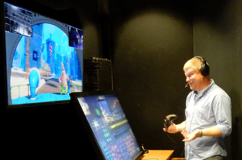
If you can communicate a page of treatment text into a single image, you're doing pretty good. The image shown here was for a game demo, not a theme park attraction, but concievably it could work for an attraction. It gets a fairly complicated concept across quickly and visually. This is also a good example of using non-physical elements to aid performance. A well-placed special effect can be worth its weight in gold.

Build Up from Strength

Once you have hit upon a compressed, distilled version of a scene, it's usually pretty easy to add complexity to taste (and budget). Later in the project cycle, when the cuts come, as they tend to do, the team may still have an alternative as tough decisions get made.


Design Guide #7:
Keyframe & Real-time Editing
Belong Together


G29T (2010) - 20 minutes in 4 weeks

For G29T, I was tasked to deliver a 20 minute dialog-loop performance in four weeks. With figure down-time that was one minute of finished animation per shift. This figure falls on the lower end of medium complexity, but it still takes a lot of labor and aesthetic experimentation to work out a Guest-ready performance. It's hard to imaging an animator matching that speed and quality with a keyframe-only editor.

I appreciate why some people tend to dismiss the real-time animation tools used in the past for theme park show programming, but I've spent considerable time working with both keyframe and real-time editing tools and with an integrated workflow that supports both I can generate equally strong performances 4-5 times faster than I can with keyframe editing alone. On the flip-side, with only real-time tools, it's faster put in broad stroke animation but is much more difficult to drill down to the precision needed for high-level performance work. Having both workflows working seemlessly together is a powerful combination for animatronic animation, and is likely to be useful in other mediums as well.

For theme park animatronics there is a productivity bottleneck during Blue-sky and Concept. You really need speed, and strong real-time puppeteering-like CG editing tools can generate rough animation quickly to help keep up with the iterative needs of that part of the process. During production, the keyframe method is more critical, as accuracy becomes paramount. Then from checkout and pre-programming through installation as the practical figure comes into play you need both speed and accuracy and the combination is truly important, as is the ability to edit while watching show playback. And for interactive shows with soaring content needs, high-productivity and efficient real-time testing is crucial as well.


Pipeline Continuity

The big magic trick required of a modern animatronic pipeline is maintaining a performance sample - a CG rig and animation - that accurately reflects creative intent at the outset, continuously represents the evolving state of figure design and performance capability throughout design and production, and then smoothly becomes the show data that drives the practical figure through installation and turnover. For those who don't actually have to make all that happen it might seem like a straight-forward process, but if the messy undercurrents of physics, gravity and figure finishing aren't respected and properly managed, unpleasant surprises are guaranteed.

Having an integrated editing toolset helps make it possible for an animatronics animator to keep Creative and Engineering on the same page, even through the transition from the theoretical to the real-world.

Digital Design

By definition, all of the work prior to figure rollout will be CG-based. But speed matters - particularly during Blue-Sky and Concept. Fast-iteration - throwing lots of ideas on the wall and then tossing most of them out is the name of the game, along with some degree of feasibility and risk assessment. This demands CG production speed that exceeds what can be done with traditional figure rigging and animation. High-efficiency, real-time tools can be extremely helpful in getting visual options in front of the Creative Director to move things forward.


Shifting to the Real Thing

These days the design process for high-end figures includes significant mechanical simulation rigging and data analysis tools. This is a critical advance, allowing us to do things we couldn't have considered just a few years ago, enabling us to take full advantage of electric servos and other emerging technologies, and to better assess risk early in the process.

A common misconception, however, is that the simulation will accurately translate directly to a precise replication of the CG performance on the physical figure by just converting the data into a format usable by the control system. There are a handful of real-world factors that get in the way, including:

- Motor Response: Response curves vary based on the size of the motor and they often require data timing adjustments. Most systems don't account for the timing issues this creates, which can be significant.

- Mechanical Design Anomalies: Human and animal figure designs get complex, and sometimes unexpected things happen, even with the best of digital design and analysis efforts. These can introduce abberant or unexpected motion - little tics - that have to be managed by the animator.

- Figure Finishing: The costume, skin and shell elements introduce variables that can affect motor performance, range of motion and secondary issues that affect visual performance. These cannot be effectively modeled in the actuator-space rig, or at least not within the scope of most projects.

- Animator Input: Pushing the animation requires that the animator assess the specific, detailed strengths and weaknesses of the figure. Making subtle, or sometimes major, structural changes to the performance based on a nitty-gritty evaluation of what works best on the physical figure is often necessary.

- Field Discoveries: Issues tend to be discovered during Installation that weren't anticipated in Concept and have to be resolved. And there are also often performance opportunities that weren't anticipate that can improve show quality.

To get the full level of performance value out of a figure, an animator still needs to be actively involved with figure setup and then tailor the performance data to find the right balance of show quality versus maintainability in cooperation with the engineering team.

Best of Both Worlds

Integrating real-time animation tools with existing keyframe animation and an integrated pipeline isn't rocket science, and it's just one piece in the puzzle, but it can help unify development processes that have tended to silo with some of the technical advancements that have emerged over the last decade or two. Respecting both digital design-driven mechanical design and the practical realities of figure performance doesn't need to be an either-or issue. A robust control system can be a core design requirement and still allow Creative team participation in playback structure and motion editing. It just requires that a development team recognize all of those with a part to play in delivering amazing animatronic experiences. My personal feeling is that if the pendulum swings too far in any direction the project will tend to be less successful - cost too much and/or not deliver as expected.

We need a lot of collaboration to do our best work, and the tools we choose can facilitate collaboration or make it more difficult.


Design Guide #8:
Actuation & Control


Meeko (2001) - Portable Animatronic

Meeko was a proof-of-concept to explore how dimensional animated figures could be used in conjunction with live performers in an open environment. All animation, playback/control, actuation, audio and FX were packaged within the basket. Sequence timing was managed via button triggers in one or more of the props. After the end of the show, Pocahontas would do photo ops with Guests, and Meeko would pop out of the basket just in time to photobomb the picture.

David Gottlieb came up with the original story, and the WDI D&P technical development team developed it, with me providing creative leadership (and raccoon character audio). The biggest challenge of the project was just in finding a pair of characters that met all the baseline requirements, so in that way it wasn't really much different than any animatronic project - picking the right target is always the most critical part. The rest was just about making use of a great team of really talented people who enjoyed working together, and making sure they got the resources and the guidance they needed.


Positive & Negative Electrons

Electric actuation has recently come into its own as the darling of theme park animatronic design, with its clean operation and some major advancements in control and, for some solutions, in packaging. It's a very valuable tool in the toolbox, providing new performance opportunities in terms of range of motion, positional accuracy, and in some cases, speed - as well as the potential for getting figures closer and more responsive to Guests.

There's no denying its advantages, but new challenges have come along with the shift from hydraulics to electric motors:

- Power vs. Packaging: Getting actuators to fit into very specific organic shapes is a huge design issue, and hydraulic actuators has roughly a fourfold advantage in many situations. Some areas, like hands, tend to get impacted more than others.

- Weight Budget: As power requirements increase as more weight is added to the figure, larger motors are needed. When electric motors are overtaxed, they tend to overheat and fail. In addition to hydraulic actuators being able to handle more load in scale, they tend to not move rather than break under pressure. This creates a situation where there is greater design dependency between assemblies and less design flexibility as issues arise.

- Setup & Control: Setting up electic servos takes significant control engineering skill and tends to push the artist out of the process. Getting the look and feel of each function right and all functions to work together aesthetically requires artist input and can require adjustments be made throughout the final performance editing process. Doing effective setup on electrics has essentially changed from being a cooperative task between artist and technician to more of a tennis match. When schedules and budgets get tight, as they always do at the end of the project cycle, this can impact show quality.

Air & Oil

Like electric servos, other actuation methods have their strengths and weaknesses.

Pneumatics (air actuation) is much cheaper than most other options and has, generally, better safety and environmental specifications. Unfortunately it also doesn't usually move all that well or very predictable, making air a bane to animators - natural control freaks - who expect figure functions to move organically and consistently. For the most part, I spec air for simple animated props mostly, and occasionally for other things. But for figures with compound movement it is not usually an effective tool to build strong performances with.

Hydraulics (liquid actuation - usually an oil) has great power and general control characterists as a result of being able to put the power source way off-board so the power generation doesn't have to occur inside the actuator itself. Air has this same configuration, only gas is highly compressible, which for a number of reasons makes movement less predictable (and also is unsafe at very high pressure). Oil under pressure in a tube/hose essentially acts like a flexible piece of steel. That's a bit of an exaggeration, but is a good analogy. I love hydraulics for what it allows us to do in terms of figure design and movement.

Unfortunately, hydraulics is just a nightmare for maintenance - it's really messy. Leaks get slimy fluid on everything - expensive costumes, delicate skin, show set, personnel and Guests (which limits design options, keeping figures at a greater distance). Failures are made more likely by the need to route large bundles of pressurized lines through the figure, which moves on compound axes, rubbing and pulling from multiple directions. Due to all the lines, repairs can be difficult, time-consuming and expensive.

There are other actuation methods as well, each with plusses and minuses. The bottom line is that there is no 'free lunch', but knowing the strengths and weaknesses of the actuation toolkit is very useful in selecting an effective target, so the creative intent specification gets close to something the production and maintenance teams can work with.


Editing & Playback

One of the things that sets animatronic editing apart from CG animation editing is the thing the animator is analyzing is not on the screen. The animator has to view the figure, scene and attraction the way the Guest will, and adjust movement (bigger, smaller, faster, slower... different) based on what Guests will actually see, making the UI workflow relationships notably different from what is common for film and game production. Hopefully the digital design effort will have maintained the performance to be fairly close and the adjustments will be minor, but I can tell you from first-hand experience, it's not heathly to bank on that. Things change, and other things just don't come out the way they were expected to, from figure finishing and skin tears/wrinkles to sightline, ride, lighting, FX surprises, to decisions that some functions have to be disabled and locked off. The final push to deliver a show demands skill, flexibility and efficiency.

One of the first tasks I had when with WDI in the early 90's was to update the UI for the editing software/hardware in conjunction with others in the group. Over the following 5 years I and the other animators and show programmers worked with those tools daily and came to understand its strenghts and weaknesses. In the mid-90's we had the chance to re-design and upgrade the entire system and implemented features to address deficiencies, such as including curve editor-based keyframe animation. I've now had roughly the same professional time spent with Maya editing and those proprietary real-time tools, and see value in integrating both editing environments for pipelines I help build in the future.

- Pre-vis Editing & Digital Design: Performance editing done prior to assembly of the figure.

- File Transfer Figure Editing: Converting data generated on a CG rig into a format that can be imported into the figure control system. This process implies that changes made will only have visual feedback from the CG rig. Notes from animatronic playback figure have to be video'd or otherwise observed without a direct editing loop. Any significant differences that exist between the CG and animatronic playback will result in a very iterative, slow and painstaking process.

- Real-time Playback Linked to Editing: 'Real-time' is not a great term, as it means different things in different contexts, particularly when used in relation to control system design. The biggest efficiency, most needed by the animator, is to be able to play a specific segment of a performance (not necessarily from beginning to end) quickly and easily. Then, just as quickly and easily, edit the performance data and immediately replay it. The faster this basic editing loop is, the more efficient the animator will be, as they are likely to do thousands of edits in any given session, many of which will be undone or written over as solutions to problems are experimented with, thrown away, or pursued. If the animator can achieve and maintain deep-focus for long periods of time, with an efficient workflow, high production speeds are possible.

- Real-time Input Editing: This might be a waldo replicating an arm & hand, and/or a few rotary knobs/sliders and/or some for of mocap wearable for generating and capturing compound motion on multiple axis. There are many ways to approach this class of editing, but the salient criteria for me is that it permit the animator to work with a more performance-based workflow, generating organic motion with their own body rather than through mouse drags. Having worked with Henson's Muppet team I recognize the qualitative value of solving performance problems with less deconstruction and more spontaniety. The trick is to make that available without slowing down the rest of the animation process - it has to be quick and easy to accomplish and something the animator can do alone.

- Figure Setup and the Show Environment: The editing won't be of any use if the response of the figure, or speed of the vehicles, or placement of set pieces or lighting changes dramatically. And the more those elements deviate from pre-vis expectation, the more work there will be to do. As a consequence, the animator also often ends up being part coordinator to ensure that all of the pieces are in place so the work they do makes progress toward turnover.

The Line Between Art & Control

Attention paid to animatronic design is often focused on mechanics and figure finishing, but without effective control, the figure is just a statue. The challenge with control design is that it has to be effective on multiple levels, and some of the requirements of low-level and safety can overlap and conflict with those of high-level playback and animation editing.

- Editing & Playback: As mentioned previously, the animators' access to immediate playback dramatically impacts the editing effort. Most shows have control features that, for various reasons, require a level of playback and control system 'scripting' to run the show with coordinated elements. Getting the show control features working, along with all the things they communicate with - commonly labelled "integration". Integration is fundamentally messy, with dozens of different teams working in cooperation and/or tension and all trying to split up the same 2-3 shifts of the installation schedule.

- Performance & Safety: The "engineer" part of the Control Engineer's title puts responsibility for lives and equipment on their shoulders. The animator is charged with making the performance look good - the animator should respect safety but that is not specifically in our scope for delivery. Both are critical - the show has to be safe, but who's going to wait in line for a show that doesn't look good? So there is pretty much always a negotiation that takes place to find an appropriate balance.

- Show Quality & Maintainability: Figure setup impacts both of these, as does the specific performance profile. On high-profile figures it's fairly common to be called back after the show has been completed and accepted to make modifications due to operational and/or maintenance issues that crop up. For the most part, the requests will be to tone down the performance because some aspect of the motion profile is causing wear and tear that's been determined to be unacceptable. As with the initial editing effort, being able to come in, set up and make editing changes without an army of support makes this sort of thing much easier, so I prefer to have a real-time direct editing & playback system; even if the final data has to be validated through engineering analysis before final release.


Design Guide #9:
Responsive Characters


Exchange Goblin (2014)

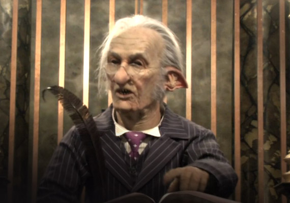
The Exchange Goblin in the Diagon Alley Money Exchange is supposed to respond believably to Guest questions. I was brought in just to do the animation - another vendor was contracted for the interactive-control scope of work.

To animate an interactive show it's critical to know what the control strategy is, as the animator has to make all of the individual bits of the show fit together seamlessly, or at least appear to, and there can be hundreds of individual segments.

In this case the control strategy didn't come until after I'd completed most of the performance editing, and when it did come it was unworkable with the figure as designed. To stay on schedule I had to come up with something, and I selected a strategy that, if implemented properly, would insure that any of the dialog segments could be triggered to look at any Guest in the room at any time with a graceful transition and an accuracy of about a half inch (+/- 1/2" from the target pupils).

What makes this tough is that there are a very limited number of functions on most figures, this one included, and to simulate orientation in a more simple way would have meant that 6 of the main head and torso functions (nearly all of them) would have had to have been dedicated solely to orientation, with nothing left to keep the figure alive. He would have looked like a static figure on an automated gimbol, with lips and eyes moving but not much else. In addition, his arm could hit the desk in about a dozen different ways, so it needed to be animated differently depending on where he was oriented.

The strategy I came up with circumented all of that, but required five complete sets of segments, over 600 in all, which was 5 times the amount I'd estimated to do the job. I completed them all on schedule, working with Chris Henrickson to develop the playback system to overcome some critical limitations of the control system as spec'd. And in the final weeks was given permission to employ another system for the high-level UI and playback control. In those last few weeks, I learned Medialon programming and tapped out about 800 lines of code to get the basic UI going (at night in my hotel room since my first shift was focused in animation). Having delivered my data, I was flown home and wasn't involved in the last push to get the whole system going, but I have confidence that the figure had the potential of being responsive and convincing.


Street Theater - Convinciness

We're creating an illusion, but instead of mirrors and light we're working with human behavior and human communication norms - in many cases, much like a street performer does. Here are just a few concepts I like to keep in mind:

Hide, Don't Show, Technology - We want the audience to be focused on the character and the story, not how cool our toys are. It's better that the audience not notice we are doing something extraordinary than to be thinking about it. If you tell Guests they are in an "interactive experience," their one and only focus will be to break it. Simulating natural responsiveness is a form of magic that is most successful when we sneak up rather than hit them over the head.

Have Escape Strategies to Get "Back to Simple" - It's easy to get caught up in trying to chase the complexity of human communication. Avoid that chase. Your show can be successful even if it's simple, as long as it's solid. Have a way to break focus and reset when things seem likely to go south. Street performers get really good at this.

Guests Seen vs. Heard - Certain types of automated orientation and eye-contact can be pretty effective and aren't very complicated to achieve, but once you attempt to do more than just look at the audience and/or use "one-way" throw-away comments, there's really no substitute for a human brain - an operator/performer. A number of things jump dramatically in design complexity when that step is taken, like UI efficiency, exponential content needed, smaller segments and more complex transition strategies - things get messy fast at that point so...

Playtest Early - What kills most interactive experiences, in addition the fallout from not following some of the notes above, is underestimating the importance of timing/pacing of the illusion. Every millisecond it takes for a figure to respond beyond the time it would take a real person is 10% off of your tip for good interactive design service. It's gotta feel fluid to feel responsive. How do you do that when you have segments that are mostly 5-10 seconds long and are triggered by an operator who has been pressing buttons for 6 hours using a multi-page touchscreen? That's another level of design. Give me a call.

Behavior as a Quilt of Moments

It's usually helpful in working with complex things, like human communication, to break down the problem into classifications with specific objectives and constraints and then stitch them together seemlessly - okay, so it may be a quilt that actually looks like a sheet.

Mix Control Strategies - You can often do things with fully canned playback that you can't with forms of automated orientation, particularly with animatronics where there are a very limited number of axis to work with. So if it fits the story, work in moments where you can mix things up in terms of control strategy and performance strengths. Some Guests may think they have 'figured it out' - but show them something different while maintaining performance consistency in the ways that matter and it will increase the level of magic. Writing and transition strategies play an important role in this as well.

Find Gags with Legs - Once you've tested an idea that you can playtest and verify as being 'watertight' in terms of performance quality in most circumstances, you'll want to get the most of it - carefully writing it in so a giant tech finger isn't pointing at it, but feels like something the character does naturally. For example, if you can identify small children, where their eyes are and when they have hidden their eyes, you might be able to play 'peekaboo'. That game can stretch out for quite a while, or be disengaged quickly and easily.

More Playtesting - It's my belief that the best way to develop better interactive design is 'practice, practice, practice'. Once past the first level or two of design complexity, this is a challenging nut to crack. Street performers learn by doing. Although our work has additional layers of difficulty (having to deconstruct and reconstruct everything), that's a pretty good model to follow.


Transitions

Most of the interactive shows done in the last couple decades have focused mainly on scripting - selecting a large number of dialog lines and connecting them together with fairly simple branching logic. Between any two sentences there is - always - a common blank "space". However, a figure has to be in a pose, and to use a common pose for everything is painfully restrictive - and problematic for timing/pacing. Doing so requires that there be enough "blank space" between lines of dialog to get to the common pose and then back to the next first move, which also tends to look awful. This is often realized way late in the process, sometimes patched with some additional transition complexity and compromises to show quality.

Ultimately, responsiveness drives segments to either be extremely short and/or have a level of arbitrary (or semi-arbitrary) 'jump-out' capability and a robust transition strategy that can handle getting from any out point to any in point with presentational grace and appropriate speed.

More effective control structures are certainly possible, but have been historically hobbled by issues surrounding the limitations of the data structure. I did some initial work in this arena to add transition-specific information to the standard performance data format a couple decades ago wit some success. To make big strides forward, however, I believe animation needs a new data type - one that robustly defines transitions and embeds performance meaning in the structure itself - I'm working on that presently.

Managing Production Complexity

Another key factor in interactive design is the sheer volume of content required to provide enough playback options to give a convincing impression of being "in the moment". If a performance is one minute long, will five minutes of content be enough? Ten? Once you drill down to the details of transition strategy and do a full estimate of the animator labor, figure support, playtesting/creative reviews/adjustments, control support, data testing, etc. - the budget (and schedule) can quickly move into the red zone. It's very hard to get past a rudimentary level of Guest responsiveness without having animation content production costs skyrocket. This is a big deal in the game industry and a major challenge for their pipeline and business model.

It's not easy to get around the basic math of needing a lot of content, but there are ways to approach some of the multiplicative factors. The main obstacle is the ubiquitous static data type that is the current standard for all digital animation:

Robust Transition Representation Embedded in Data - see "Tranistions" at left. This would reduce 'bandaid' structural complexity, improving review/adjustment efficiency, simplifying performance testing and control support requirements.

Behavior Parameters Embedded in Data - Having information about how to process character motion would be a major benefit to both presentational complexity and production costs beyond an initial character definition production effort. As complexity rises, the amount of labor required to produce animation segments would drop significantly and could be distributed over a broader spectrum of animator resources with less impact to performance quality. An effective workflow link to existing animation production methods is a critical part of making this functional. I am actively focused on developing this concept.


Design Guide #10:
It Takes a Village


Hagrid & Skrewt (2019)

On these figures basic performance requirements were not accepted by the mechanical design team. The result was that Hagrid was much less dynamic than he should have been, given the staging, duration of the scene and the cost of the figure. Design issues worked out in the initial creative intent specs but not implemented (not because they weren’t achievable but simply because the baseline design requirements weren’t addressed) left the Skrewt with an impressive upper half but an overall resemblance to a popsicle on a stick.

Producing competitive figures requires all cylinders to fire in concert; the organizational engine must be carefully structured to make that happen. High-end design opportunities are few and far between - you've gotta make the most of each and every one.


Duty Cycle, Safety & Duty Cycle

Animatronics for film only have to work long enough to get one good take, but for theme parks everything has to work reliably all day, every day, for many years. And we have to keep everything safe - Guests, employees and the equipment. This creates heavy-duty design requirements that dramatically change the game.

Engineers will do the math to work out what that means, but the Creative team still has to set an achievable target. Navigating through evolving theme park operational requirements and knowing what has worked (and what hasn't) in the past is a key part of the process.

The Asymptotic Edge

New attractions have to be fresh and exciting. This naturally pushes design to the bleeding edge of possibility, right where the risks start to increase exponentially. There's no easy way to avoid that, but there are methods for mediation. Probably the best way is to gather a team that is the best in the business, who work together well and respect the vital collaboration of art and engineering in finding a path through the maze.

The rest is really just hard, focused work, which occasionally will hit a brick wall and have to back up - sometimes back into Concept (which implies budget and schedule coordination). It ain't easy or cheap to ride the asymptotic edge.


Precipitous Fall When Shooting Too High

I've always winced a bit at Marty Sklar's famous "blank sheet of paper" paradigm. It's not usually advisable to just toss idea, no matter how amazing, over the wall to Design & Production. It's an inspirational approach, but functionally the animatronic design process is just messier than that, even in Blue-Sky.

Mainly it's "the wall" that I take exception to. If you set a target that is way out of the realm of possibility, a production team will often accept the challenge and do what they can to achieve it, but the difference between expectation and delivery will be significant, and usually disappointing. Basically, if you aim too high, you tend to fall much farther than if you set a near-achievable target.

That doesn't mean that a design target shouldn't be a challenge, just that feasibility is also an important part of the process and it's vital that the Creative and Technical teams work cooperatively throughout the project cycle - beginning, middle and end - to have some confidence that you can deliver on promises to stakeholders.

Measure of Success

Ultimately it's the experience Guests have while in the park that drives revenue through the exit gate (compared to the 'entrance gate', or new business, being driven mainly by marketing). I have found that some of the simplest examples of integrated story, character and mechanical/control design have sometimes been the most effective. It's easy to get wrapped up in the excitement of wrangling technology and miss low-hanging ways to bring a park to life. A few well-placed pop-up, peekaboo eyes might be all it takes to give many children a feeling that there is magic inside the berm.

I still go to theme parks largely because I felt that sense of magic when I was young and place a high value on those memories. I expect that is a common experience for many of our Guests.


Pipeline, Process & People

Animatronic design for theme park entertainment is a demanding and elusive craft, but it isn't unknowable - an experienced, thoughtful strategy can significantly reduce risks and provide continuity throughout a project so that stakeholders stay informed on progress, good design decisions are made, surprises and unexpected costs are minimized and a Guest-pleasing performance is delivered.

Building an Effective Pipeline & Process


Basic Off-the-shelf Design Software

One Toolset to Bind Them

There are lots of mouths to feed in the design process. Building a core set of tools that are reliably interconnected to allow information to move accurately and efficiently between disciplines is a key objective.

I like to have Maya at the hub of animatronic development - preferably with custom plug-ins for high-efficiency editing, real-time output, advanced rigging & data analysis. Different project phases require different deliverables, so the process can still be quite involved, but using one well-established application for the bulk of the work has big advantages. And when finding talent with character experience you have a fairly large pool to draw from.

Accuracy and Integration

Mechanical engineers tend to use SolidWorks as a common baseline tool, and passing Maya data to SolidWorks and back is a core requirement and challenge in the figure development process.

For integrated simulation of an attraction experience, the Unreal engine is a strong tool that connects pretty well with Maya - basically allowing the project to build a visualization BIM so all teams can share information as elements progress.

There are tasks which require other specialized software and/or custom tools, but these three tools together can provide a powerful framework for figure development, integrated digital show design and interactive show development.
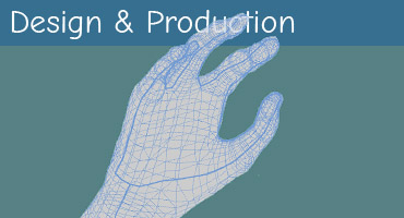

Maya

The Need for Speed

Modeling, rigging & animation are natural bottlenecks to fast iteration and presentation of ideas & options.


SolidWorks

Passing the Baton

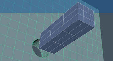
Engineering teams require a high level of spatial precision
- not most artist's strong suit -
triple-check and ask lots of questions.


Unreal

Integration-O-Rama

The payoffs of an integrated visualization system can be huge, but so can the challenges - it can be a deep dive.


Key Focus Areas by Phase


Animators & Tech Designers


Engineering & Fabrication Team


Overall Project Team


Quick & Dirty

90% of this work gets tossed out. Sketch when possible, use massing 3D when needed and spot-check with other disciplines for feasibility. Work very, very fast and provide A/B/C options.


Risky Assessments

Focus for technical teams is on providing feasibility regarding technical risks & opportunities with very little info and without impeding Creative team momentum.


Riding the Storm

A good icon for this phase would be a tornado. The first pitch elements to get execs excited tend to form the framework that drives the rest of the show design.


High-Wire Act

Most figure performance and staging decisions have to be made here. Tensions between Creative goals, technical possibilities and budget must be resolved - shooting too high drives up costs and, ultimately, reduces show quality.


Rough Numbers

Generally speaking, Concept requests from Creative will often seem impossible and the pressure to give a nod for feasibility approval when there isn't enough info will tend to drive WAG budget estimates into the stratosphere.


Finding the "Wow!"

There's so much to do in Concept, and so little time in so many different arenas, but much of the focus has to be on how the project is going to blow Guests' socks off to be worth all the trouble. ...and then lock down a buildable target.


Lockdown

The figure specification package has to be strong enough to drive the design and production of the figure and facilitate a continuous link between Creative performance expectations and technical decisions - no small task.


Waterproofing

Schematic is about the last chance to jockey for major adjustments before committing to project deliverables. It's always best to keep the engineering and fab teams in the loop to make sure that D&P gets off to a positive start.


The High Dive

After Schematic, any major changes to overall show design will likely be very costly, both in terms of budget and show quality concessions necessary in other areas in order to keep the project in balance. Feet are springing off the diving board.


Long Waltz

The design teams need clear direction but also respect - and space to get the work done. Much of the production phase is taken up with regular communication and response to emergent issues, updating performance rigging/animation to align with changes and working between the Creative and tech teams to find solutions, maintain transparency and work with project management to address budget and schedule issues.


Square Pegs-Round Holes

Figure design & production is ultra-susceptible to hitting brick walls. Once committed to creative intent specs, big decisions get made that can't be undone without significant re-work and budget impacts. As such, conferring with the Creative team regularly with issues and options is critical to avoid getting stuck with unworkable options. Of course, that takes time, which can be an issue as well.
...tricky stuff.


The Creative Trust

Although the production phase is long, projects are incredibly complex and there is always a mountain of things to keep track of. The Creative Director should be able to trust the animatronic animator to bring issues to their attention in a way that facilitates quick review of show impacts so that they can provide effective direction. In some ways, the Animator functions like an Assistant Director for this specialized medium.


Making the Big Leap Small

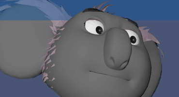
There's no way to totally eliminate the conversion of pre-vis performance data to actual figure animation data, but the disparity can be managed by first having an invested, experienced animatronic animator manage the digital design effort.

Then, for the transition effort, provide them with high-efficiency tools and solid cooperative support by the mechanical & control team.
Validation & Tweaking

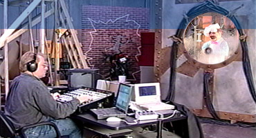
It's a big moment when an animatronic figure comes off the line and is first put through its paces, only it isn't really a moment - more like phase. It takes a significant amount of setup to get the mechanical, figure finishing and control systems to work together the way they are supposed to, and do so reliably. Everyone wants this to happen quickly, but shortchanging this process is dangerous - it's the last real opportunity to apply a fix.


Final Strategic Huddle

A lot is on the line at figure checkout - animatronic figures are usually key show elements and have absorbed more than their share of project budget. After literally years of anticipation, the team will find out if they are getting what they expected. To truly evaluate the figure, a full scene mockup may be needed; sometimes re-design might be necessary. This is the last possible time for strategic planning adjustments before the sprint of field installation.


Losing Weeks to Get Hours

In theory, the animator would only really need to make some small tweaks in orientation to accommodate sightlines and/or make minor timing adjustments, but in reality, there is still a lot to deal with. Just getting time to work on a figure at all is usually a major challenge, let alone with other show elements functional and available for efficient review and editing. In addition - for many reasons - significant re-animation with iterative in-show review is often necessary.


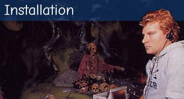
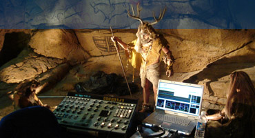
Final Sprint (Siege)

Calling an install a sprint doesn't seem to be sufficient. It's always many times harder to make progress than expected, with multiple teams all vying for the same few shifts every day, inter-dependent tasks done too late or so early they block progress in other areas. Installation usually feels more like a siege than a sprint — an exciting one, though, with lots of truly talented, knowledgeable and dedicated people all focused on delivering the show.


The Patience of Job

One of the challenges for the team during installation is to maintain the energy to manage the many, many compromises that are required during this phase without losing sight of the original vision. There is intense urgency to get things wrapped up and turned over and Producers and Creative Directors are spread very thin. Team members that can work independently and assist in coordination tasks to make progress are extremely valuable.


Building an Effective Team


The Importance of Tension


Geodesic Dome of Design Solutions

Like a geodesic dome, an effective animatronic figure is the result of thousands of elements that are interdependent and in tension with each other.

One of the challenges of this craft is navigating for a balanced design risk and performance goal so the end product is amazing, but also achievable (but often just barely achievable).

Inter-Disciplinary Tension

Projects teams are made up of extremely talented people who know their areas of expertise very well. Much of the problem-solving in attraction development is dependent on variables in multiple specialties and often simply achieving basic communication between disciplines can be a challenge.

Each discipline has its own vocabulary, and there’s often a confusing overlap of identical terms used to mean very different things, and each is subject to its own natural biases. When intense collaboration is required, a ton of resources can easily be expended - sometimes without making much real progress.

Hard Shell Center

Communication challenges are particularly significant in areas where the greatest collaboration of disparate knowledge is required. A high percentage of the decisions driving success fall into this center region, where the creative team must understand engineering issues and vice versa and both groups have to simultaneously address cost and schedule feasibility to forge a solid path forward. With animatronics this area stays "hot" throughout the project life cycle.

This problem-solving nexus is a critical nut to crack in team development.

Animator as Interpreter

One effective method for addressing the "hard shell center" is by training a small group of Subject Matter Expert animatronic animators (with strong CG skills) as specialized resources to:

- Provide performance animation support throughout a project and assist the Creative Director

- Act as a communication conduit and assistant between technical and aesthetic teams, making sure critical questions get asked, understood and resolved.

- Build and apply craft-specific knowledge to fill expertise gaps for vendor and internal teams.